Test Logo
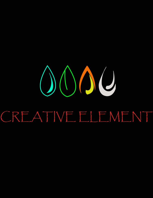
This is my logo for our test. The first thing I thought of when I thought of elements was the main four water, earth, fire, and air. So that is what I put into the logo.
Advertisement Project
I chose the Scovill Zoo. I looked it up on Google and got on the zoo's website. That is where I got all my information. I also looked the zoo up on Google images and got my pictures from there.
Photoshop Project
The first is my surrealism one. I wanted it to be funny so I put a woman on an ostrich. The woman was originally from a picture of her riding a horse. The main tool I used was the quick selection tool.
The next is my realism one. Nature is what I thought of first. So I took a picture of a deer and nature itself and put it into Photoshop. I used the quick selection tool and the burn tool the most.
And the last is the typography one. First thing I thought of doing was a dog so I googled my favorite type. I then put it into Photoshop.
Logo Project
First I chose the star. When I thought of a star, I thought of a celebrity. I also thought of the walkway in Hollywood with all the names on them so that was what my first design was. I then put the stars next to each other and it made a diamond and diamonds make me think of jewelry so I made a jewelry store logo.
Next I chose the shape that looks like an olive. An olive reminded me of a martini so that is what I made. Swank Martini is a company that sells martini glasses so it was the perfect company for this logo.
Lastly, I chose the cat. I decided to make it a company that sold cat toys. I had to edit the original cat to make it's paw be raised as if it were playing with the ball of yarn.
Typography Project
The first word I chose for my Typography project was Projecting. I looked up images and I saw a spotlight which gave me this idea. It's supposed to look like a light is being projected out.
I chose the word Chained. My idea was to make the word look like chains. So I used the ellipse tool to make individual oval in the chains.
I chose the word Chained. My idea was to make the word look like chains. So I used the ellipse tool to make individual oval in the chains.
Tomato Heart
I made this tomato off of a real picture of Google. We used the mesh tool to get the exact colors we needed and used the pen tool to outline each individual part.
Pen Tool Project
This is my drawing by hand. The next image is of my finished drawing on illustrator. I primarily used the pen tool to do the drawing on illustrator.
Tinkercad
Our group chose the game Sorry. We decided to make it Disney themed. Donald is one of the game pieces in Mickey Mouse's section.
Daisy Duck is another one of the game pieces in Mickey Mouse's section. I used tinkercad to create these pieces.
Then there is Minnie Mouse. The last piece in the Mickey Mouse section. She was a fairly simple one to create.
Daisy Duck is another one of the game pieces in Mickey Mouse's section. I used tinkercad to create these pieces.
Then there is Minnie Mouse. The last piece in the Mickey Mouse section. She was a fairly simple one to create.
